
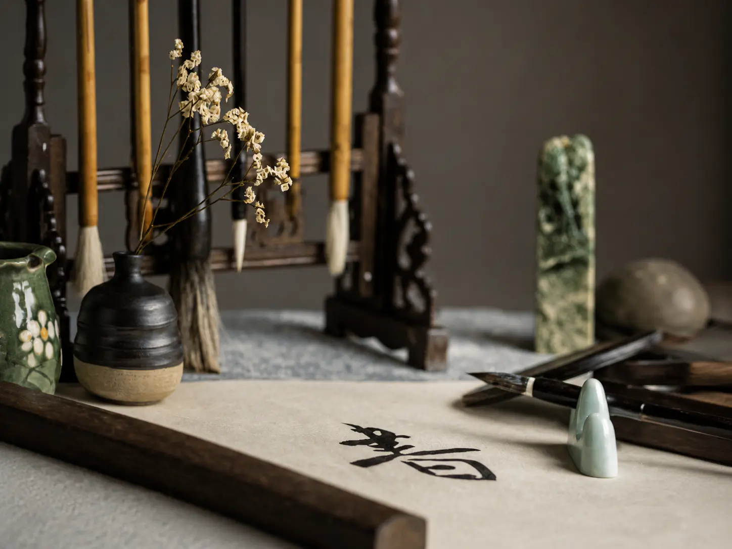
What is Chinese calligraphy?
Chinese calligraphy is not decorative lettering added to a finished design. The act of writing is itself the artwork. Everyday handwriting aims mainly at communication; calligraphy treats brush path, stroke order, ink density and compositional balance as expressive structure. The Met's Heilbrunn essay stresses that calligraphy records order and dynamism in the written mark - the character's form carries meaning alongside the language it denotes.
Writing, handwriting and calligraphy
Writing produces readable characters. Handwriting is the personal everyday form of that writing. Calligraphy is writing practised so that controlled brush movement becomes visually central - not merely neat decoration around a design.
Brush movement recorded in the mark
Because the soft brush responds to pressure, angle and speed, the finished stroke preserves a sequence of physical decisions. Viewers can often follow thickening, thinning, turns and lifts even before they read every character.
Stroke order and controlled irregularity
Traditional stroke order gives structure and flow. Skilled work is rarely mechanical uniformity: slight variation in thickness, spacing and rhythm is part of the art, not a flaw to erase.
- Definition: Chinese calligraphy is not decorative lettering added to a finished design. The act of writing is itself the artwork.
- Language meaning and visual form operate together; neither replaces the other.
Why calligraphy is more than handwriting
Calligraphy sits at the intersection of language, trained movement and visual composition. It is judged by more than legibility, and 'beautiful' does not always mean neat.
Language
Characters carry lexical meaning, historical forms and literary register. Knowing roughly what a text says - poem, dedication, official phrase - changes how composition and emphasis read.
Movement
Brushwork records pressure, speed, turning and lifting. The eye can track energy through a line the way a viewer tracks gesture in dance - without reducing the work to personality fortune-telling.
Composition
Spacing between strokes and characters, vertical or horizontal alignment, density of ink and use of empty ground decide balance. A page can feel open, compressed, reserved or rushing even when the same characters appear elsewhere.
- Beautiful does not always mean neat. Running and cursive scripts prize continuous motion and expressive irregularity; a tight regular script prizes clarity and discipline. Different ideals apply.
- Brushwork can suggest temperament or training tradition in broad art-historical terms, but there is no reliable method for reading a person's private personality from a brush line alone.
How Chinese calligraphy developed
Chinese calligraphy developed across centuries of inscription, administrative writing and literati practice rather than appearing as a single invention. Museum surveys such as the Met and Smithsonian present five major script categories as a practical map - selective here, not an encyclopedic dynasty list.
Early inscriptions
- Bone, bronze and early stone writing establish durable marks and character structures that later scripts reform or borrow from.
Seal script (篆书, zhuànshū)
- Rounded or elaborately structured forms used for seals and archaic revival; visually dense and often slower to write than later scripts.
Clerical script (隶书, lìshū) - Qin to Han
- Flatter, more horizontally stressed characters suited to administrative writing on bamboo and silk; a bridge toward later common styles.
Running, cursive and regular scripts - late Han into medieval periods
- Regular script (楷书, kǎishū) stabilises clear individual strokes; running (行书, xíngshū) links motion between characters; cursive (草书, cǎoshū) compresses and abbreviates for speed and expressive continuity.
Calligraphy as fine art and Wang Xizhi
- By the medieval period, calligraphy is collected and theorised as a high art. Figures such as Wang Xizhi become paradigmatic references for later copyists - models of brush vitality, not mere neat copybooks.
Literati practice and modern continuity
- Scholar-official and literati circles link calligraphy with poetry and painting. In the modern era the art continues in education, studios, exhibitions and public inscriptions, alongside UNESCO recognition of living practice.
Script names are historical categories used by museums and teachers; they are not interchangeable with Western typeface names.
The five major script styles
These five names are script categories - historical ways of forming characters - not fonts you switch on a computer. The same text can be written in more than one script with different visual effects.
| Script | Chinese | Pinyin | Main visual character | Typical use or association |
|---|---|---|---|---|
| Seal script | 篆书 | zhuànshū | Rounded or archaic structure; often evenly weighted lines | Seals, titles, archaic or formal display |
| Clerical script | 隶书 | lìshū | Wider, flatter silhouettes with distinctive horizontal flares | Han administrative heritage; modern titles and signage |
| Regular script | 楷书 | kǎishū | Clear, separated strokes with stable proportions | Learning, formal texts, readable inscriptions |
| Running script | 行书 | xíngshū | Linked motion between strokes and characters; still mostly readable | Letters, informal art works, everyday educated hand |
| Cursive script | 草书 | cǎoshū | Highly abbreviated, continuous lines; hardest for beginners to read | Expressively fluent works; requires training to decipher |
Regular script is usually the easiest starting point for learners because strokes remain distinct. Running and cursive scripts demand stronger control of continuous motion and abbreviation.
The Four Treasures of the Study (文房四宝, wénfáng sìbǎo)
Museum teaching collections such as the Smithsonian's China's Calligraphic Arts materials and UNESCO notes on calligraphic instruments describe brush, inkstick, paper and inkstone as a connected system, not four isolated souvenirs. Inkstick plus water on the inkstone produces usable ink; the brush delivers that ink to paper. Changing any one element changes the mark.
Writing brush (笔, bǐ)
- A soft tip (often animal hair) held in a handle. Tip resilience and size affect line width, taper and turn. Soft brushes make pressure and angle visible in every stroke.
Inkstick (墨, mò)
- Solid ink ground with water on the stone. Grinding time and water ratio control blackness and liquidity. Ready liquid ink is common in beginner classes, but stick grinding remains part of studio practice.
Paper (纸, zhǐ)
- Absorbent papers respond quickly to ink load. Xuan paper (宣纸, xuānzhǐ) is a classic writing and painting support. English English 'rice paper' is a loose label and often inaccurate for the fibre content in use.
Inkstone (砚, yàn)
- A hard stone slab with a grinding surface and well. It is where inkstick and water become liquid ink - the preparation step that ties the other three tools together.
UNESCO also documents related craft traditions such as Xuan paper making and Chinese seal engraving as distinct intangible heritage practices that sit beside calligraphy rather than replacing it.
How brushwork creates expression
Expression in Chinese calligraphy comes from coordinated variables, not from thickness alone. A heavy line can look inert if speed and rhythm are flat; a thin line can look decisive when pressure, angle and lift stay controlled.
1. Pressure
- How firmly the tip meets the paper - from hairline contact to full press.
2. Speed
- How quickly the brush travels; pauses and acceleration change ends and corners.
3. Angle
- The tilt of the brush relative to the paper and to the stroke direction.
4. Ink load
- How much ink the tip carries - saturated, diluted, dry-brush (飞白, fēibái) effects.
5. Turning and lifting
- How the tip rotates, stops, or leaves the surface at joins and stroke ends.
6. Rhythm
- The pacing across a whole character or column - even tempo versus surge and release.
Looking at pressure, speed, angle, ink load, turning and rhythm together gives a fuller sense of how a calligraphic line was made.
Calligraphy, painting, poetry and seals
Calligraphy shares materials and brush training with painting and often appears with poetry and seal impressions, but the arts remain distinct disciplines.
Calligraphy and painting
- Both traditionally use brush and ink, and literacy in brush control transfers between them. They are not the same art: calligraphy centres on written characters; painting centres on pictorial form. Shared tools explain affinity, not identity.
The Three Perfections
- Museum educators (including Smithsonian China teaching materials) describe poetry, calligraphy and painting as the Three Perfections - literati practices often combined on a single work so text, brush and image comment on each other.
Seals
- Seals mark identity, ownership or studio names in red impressions that become part of composition. Seal carving is a related but distinct tradition - itself recognised by UNESCO as the art of Chinese seal engraving - not merely a rubber stamp afterthought.
How to look at Chinese calligraphy
You do not need to read every character to observe brush quality and composition. Translation and historical context still matter for full understanding - looking and reading complement each other.
1. Start with the whole
- Notice overall density, empty ground, column or row structure, and whether the piece feels open, compressed, reserved or rushing.
2. Identify the script category
- Ask whether the forms look seal-like, clerical, regular, running or cursive. Category frames what 'orderly' or 'expressive' means.
3. Follow one character's stroke path
- Trace where the brush likely entered, turned and left. Stroke order habits make many paths legible even to beginners.
4. Watch pressure and ink texture
- Look for thickening, thinning, dry-brush breaks and wet blooms. These record tip load and contact, not accidental mess.
5. Compare spacing and rhythm across the work
- Check whether gaps between strokes and characters stay even or accelerate. Rhythm often carries as much expression as single flourishes.
6. Read seals, colophons and mounting last - then return
- Red seals, later inscriptions and mounting cloths add ownership and commentary history. After noting them, return to brush and composition with that context in mind.
Callout: you can observe brush and composition without full literacy, but labels, translations and exhibition context remain essential for accurate interpretation of subject and historical setting.
Chinese calligraphy as a living tradition
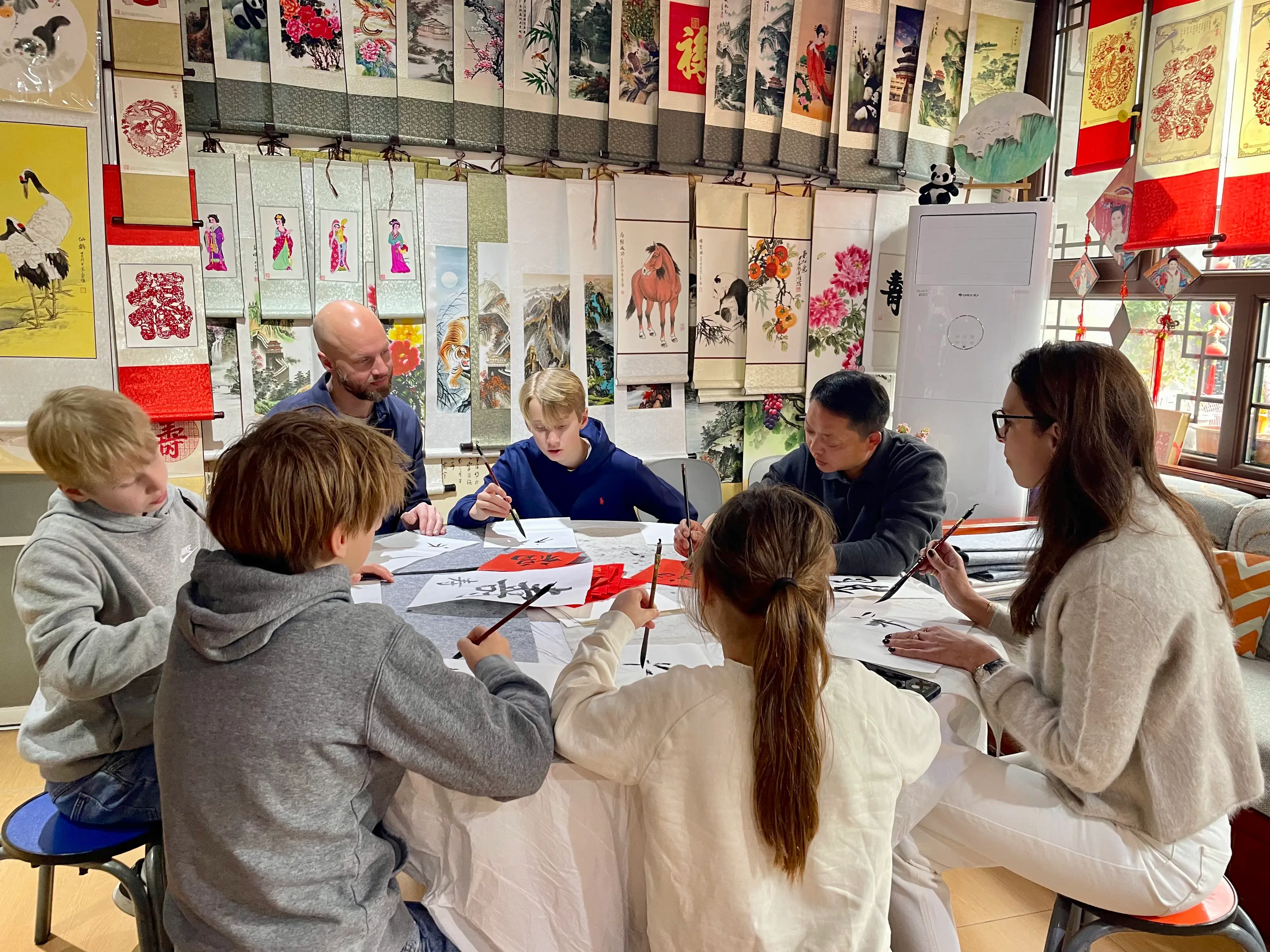
Participants engage in a calligraphy class in a room decorated with traditional Chinese art.
Chinese calligraphy continues as professional and amateur practice: in schools and studios, on shop plaques and public inscriptions, in contemporary exhibitions, and in short beginner workshops for visitors. UNESCO's 2009 inscription on the Representative List of the Intangible Cultural Heritage of Humanity recognised a living art, not only museum objects. Practice continuing - teaching, writing, carving seals, mounting and exhibiting - is part of what the listing describes.
- Professionals, teachers and devoted amateurs keep brush practice active.
- Education systems and private studios still teach stroke fundamentals.
- Inscriptions and plaques place calligraphy in streets and interiors.
- Contemporary artists exhibit calligraphic work alongside classical copying.
- Workshops introduce physical materials without claiming overnight mastery.
- UNESCO ICH (2009): living heritage, not a closed historical archive.
Encountering calligraphy in Beijing
In Beijing you will meet calligraphy as museum art, temple and palace inscriptions, shop and courtyard plaques, temporary exhibitions, and instructor-led beginner sessions. Museum collections and historic sites show finished works and carved text in architectural context. A short class or cultural half-day lets you feel brush resistance, ink flow and stroke order with your own hand. That physical contact is useful context for later looking; it is an introduction, not a path to mastery in one sitting. Choose a session for curiosity and material familiarity; use this guide for scripts, tools and visual vocabulary; use venue pages for logistics.
- What to expect from a Beijing calligraphy session
- Calligraphy and cultural exchange in Beijing
- Beginner sessions provide physical context, not mastery.
- Inscriptions and plaques reward the same looking habits as scroll works.
Explore related guides
Experience the practice
Knowledge hub for what a beginner Beijing session covers - pace, tools and fit - before you book.
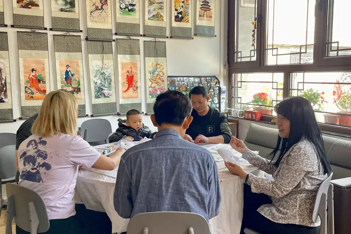
Hands-on cultural half-day: participation with brush practice alongside hutong walking and dumpling-making.
Character meaning and writing focus - radicals and name practice as much as brush aesthetics.
Age-fit participation notes for families considering a short brush session with children.
Chinese calligraphy FAQ
- Chinese calligraphy is the art of writing characters with brush and ink so that movement, rhythm and composition are part of the work itself. It is practised and judged as a visual art, not only as everyday note-taking. The Chinese term is 书法 (shūfǎ). Readers and viewers study both what the characters say and how the brush formed them.
- No. Handwriting mainly aims at readable personal writing for daily communication. Calligraphy trains brush path, stroke structure, ink density and spacing as expressive form that can be collected and exhibited. Everyday hands and calligraphic works can overlap in real life, but the goals and critical standards differ.
- The five major script categories commonly taught are seal (篆书, zhuànshū), clerical (隶书, lìshū), regular (楷书, kǎishū), running (行书, xíngshū) and cursive (草书, cǎoshū). They are historical ways of forming characters with different visual habits, not digital fonts you simply switch between.
- They are the classic writing set: brush, inkstick, paper and inkstone (文房四宝, wénfáng sìbǎo). Used together, they prepare and deliver ink for calligraphy and traditional painting. Changing paper absorbency, ink load or brush tip changes the finished mark, which is why they are taught as one connected system.
- Because the writing act itself creates visual structure - line quality, rhythm and composition - that viewers study alongside linguistic meaning. Museums collect and exhibit works for those qualities, not only for the words recorded. Controlled irregularity and brush energy are part of the aesthetic judgment, not accidental mess.
- Yes, for brush quality, spacing, ink texture and overall energy you can look carefully without full literacy. Full appreciation still benefits from translations and context, because subject, genre and inscription history change how a work is understood. Looking and reading complement each other rather than replace each other.
- They share brush-and-ink materials and often appear together with poetry on literati works, but they remain distinct arts. Calligraphy centres on characters; painting centres on pictorial form. Shared tools explain their long affinity in Chinese visual culture, not identity between the disciplines.
- Yes. It continues in education, amateur and professional practice, public inscriptions, exhibitions and workshops. UNESCO listed Chinese calligraphy as intangible cultural heritage in 2009, recognising living practice rather than a closed archive of old objects alone. Beginner classes and studio copying remain common entry points.
- Yes. Beginners usually start with posture, brush grip, basic strokes and simple regular-script characters. Short Beijing sessions give useful physical context for materials and stroke order; lasting skill still needs repeated practice. No Chinese speaking ability is required for many visitor-oriented introductions.
- Regular script keeps strokes largely distinct and clearly structured, which suits learning and formal texts. Cursive script abbreviates and links forms for continuous motion and is harder for untrained readers to decipher. Running script sits between them: more connected than regular, usually more readable than full cursive.
Continue exploring Chinese calligraphy
A short beginner session can provide useful physical context for brush pressure, ink flow and stroke order. Read what a Beijing beginner session typically covers, or see how calligraphy fits a hutong-area cultural half-day.
Further reading paths
Stay with context before choosing a hands-on format.
- Beijing calligraphy experience hub
- Character writing focus
- Calligraphy for kids
- Beijing experiences overview
What to expect from a Beijing calligraphy sessionCalligraphy and cultural exchange in Beijing